
APRIL 2024
Welcome to my April mood board. I wanted to create a space where I could share art and media that has inspired me and my work throughout each month. Follow along for some short thoughts about specific branding and design projects, as well as some eye candy pulled from the web.
I’m normally not drawn to ‘gimmicky’ creative projects or design ‘realism’ however, this project interested me for two reasons. One, it’s hard to not stop and look at food. Secondly, the quality, execution and meticulous thought that very clearly went into this. There are a handful of letters that stand out to me. The letter that first caught my eye when I was scrolling through the project was the ‘g’. I feel like using bread for the ‘g’ was an interesting choice as there really seems to be no correlation between the two. However, bread serves as a perfect canvas to carve the contours of this slab serif ‘g’.

Then we have the ‘e’ for which they manipulated a sunny side up egg. What draws me to the ‘e’ is the nonconventional or unexpected use of an egg for an ‘e’. On the surface, a sunny side up egg would be perfect for an ‘O’ - right? Nope. ‘E’ is for Egg because, well, egg starts with ‘e’.

Lastly, a few other letters that were executed extremely well.. The ‘q’ which is made of a strip of bacon - it recalls memories of crooked pieces of bacon that shrink during their time in the frying pan.

The ’n’ made of honey might be the most exquisitely executed letter of this food alphabet - the light, the shape, the stringy-drop of honey trying to escape.

And finally, the watermelon ‘u’ is perfect. As the summer begins to introduce itself here in Arizona, a bite out of the center of a watermelon slice is always on my mind.

Click on the thumbnail below for the the full project.
This brand kit for Adler Kombucha is really well executed.

First, the color palette used is absolutely perfect. Drawing on the innate colors of the ingredients, from pear to lemon to ginger - the colors feel real and have this familiar earthy tone to all of them that creates a sense of authenticity and approachability.

Second, the Warhol-esque still life style of each ingredient creates a sense of nostalgia but also simplicity, perhaps communicating to the consumer that the kombucha itself is made of real ingredients with a simple recipe you can trust. Like things used to be, ya know?


No frills here, what you see is what you get and for us brand nerds what we get is a beautifully simple brand kit with colors that are apropos, a font that’s timeless, walking the line between vintage and modern, and ingredient icons that could be framed and hung in a kitchen.
Click on the thumbnail below for the the full project.
This 50 Anos - Rodeader Project is a great example of how stunning photography can be seamlessly integrated into a brand kit or design system.

The duotone edit to the stills begins to evoke emotion by highlighting only the colors they want you to see. This immediately transports you into the brand system without showing any logos or using any copy. Then an extra layer (literally) is added with the wavy overlay.

Lastly, they use different shapes or containers to frame and re-compose the photos. They’re likely leveraging these containers to ‘crop’ parts of the image they don’t want to show while selectively highlighting parts of the imagery that they want us to focus on. The use of inconsistent shapes/containers is clearly part of the brand system and communicates a raw emotion across the visual identity.

Odd containers have a feeling of the realness to them whereas straight lines and right angles feels more produced or corporate. What’s lovely about this project is that the elements, photo treatments/edits and colors seamlessly scale across various forms of media - both digital and in-real-life.
Click on the thumbnail below for the the full project.
Everything about this edit…
The reason this edit is possible is due to two things - one element from production and the other from post production.
Firstly - basketball always looks better from a color perspective than just about any other sport which leads us to the element of producing basketball games that enables this edit. CONSISTENT LIGHTING. Because it’s played in an arena, the lighting is always consistent which allows the Celtics media team to really dial in their LUTs and color grading. It also creates predictable shadows and lighting across the entire floor.
Secondly - the editor is using masks to create this video and because the lighting is consistent, with the right masks and keyframes, the editor can seamlessly blend these clips together.
Oh, and the camera being in the same position really helps.. Like a lot.

(Not affiliated, we’re just vibing.)
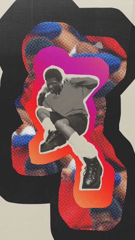
Found this and saved it as design inspiration - I love the cutout, the BW image, the layer s with the gradient, halftones and then what appears to be a paper texture in the background. Really nicely done, this could have gone wrong without controlling the chaos of this design element mash up but Buck Design absolutely killed this. It’s part of their 2021 Instagram Pride campaign which you can read about and see more of HERE.
And now for some photography..
This collection of Magnum Photos is just so good. From the seemingly unimportant moments captured to the composition and lighting featured throughout every frame. Magnum’s roster of photographers consists of arguably some of the best at evoking emotion through a still moment in time.
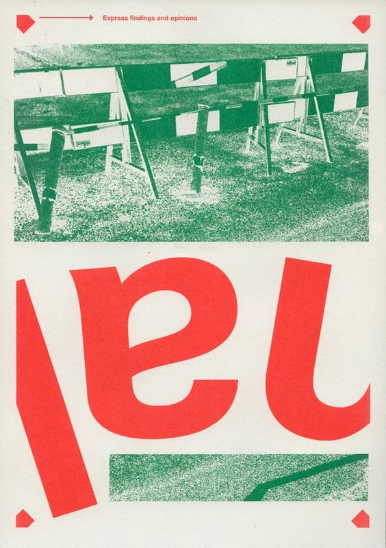
Not too much to dive into here. Whatever this is for, I like it. The color selection is great, both red and green are popping off that cream/off-white background. And I’m really into duotone effects on images. Not sure why the font is flipped but the ‘a’ looks like a quirky ‘e’. Great balance to this as well. Again, it’s nice and I like it.
And lastly - don’t forget. Make ya momma proud, okay?
Thanks for staying, thanks for reading. Talk soon!
AJ